Increasing Enrollment through accessible interfaces
NOVA Website Redesign 🫧
TIMELINE—
January - November 2023
ROLE—
UX Designer
TEAM—
6 designer (including me!)
+ 2 external agencies
TOOLS—
Cascade CMS
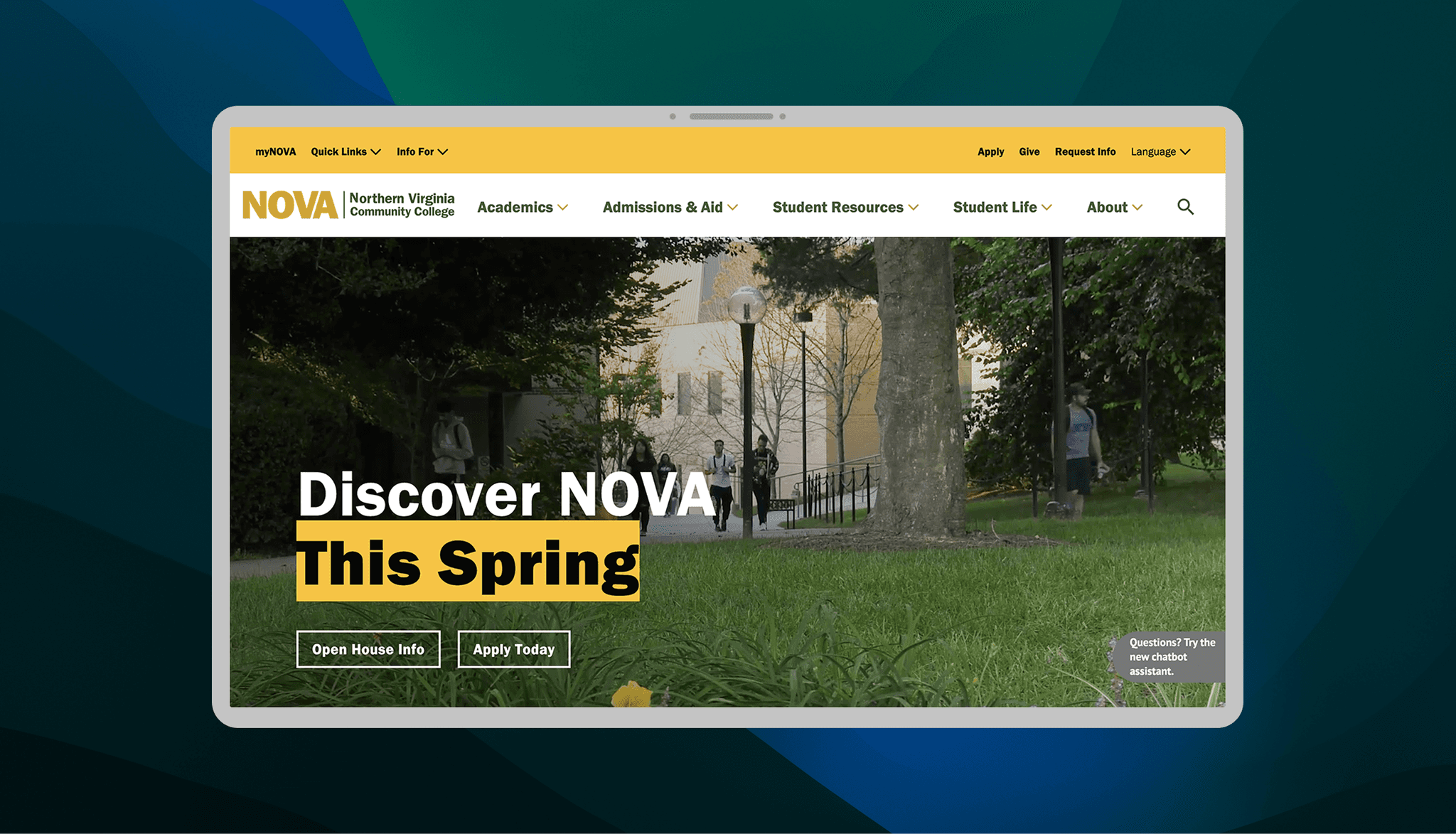
The biggest recent project the web team at NOVA has worked on is the college website redesign. Our website had not been refreshed since 2017, and it was in need of an refresh to keep up with modern website standards.
This new redesign intended to focus on a mobile-first website, ensuring that the website felt inviting to prospective new students, and kept accessibility at the forefront of the design.
This was a group project, and I was one of many working on this project which served an audience of 52,000+ current students and an unmeasurable number of prospective students, staff, faculty, and parents across the NOVA region.

Context
What is NOVA?
You might already know that NOVA means "Northern Virginia." This is a region in Virginia that comprises of several counties and independent cities in the Washington DC metropolitan area.
But NOVA is also a community college that has 6 physical campuses and 52,000 students across the region. NOVA also has an online subdivision, called NOVA Online.
Problem
In need of a refresh!
College leadership has identified a need to redesign the website to boost its aesthetics and user experience.
The overarching goal of the college is to use the website as a marketing tool and increase enrollment, while also prioritizing visibility, efficiency, retention, and accessibility.

Increased Enrollment & Retention

Accessible, Visible, Efficient!

Website = Marketing Tool
Challenges
Running out of time
Running short of time 🚨
↳ The biggest challenge for the implementation. We underestimated how long it would take to migrate 800+ pages, all while cutting down and reframing content for multiple departments without sacrificing information.
Current students are not our only users 💭
↳ Students are the target audience, but the website also had to be friendly to non-students, especially members of the general public who are looking to restart their education. This meant the actual content (i.e. text) had to be made accessible and easy-to-understand.
Reflection
Choices and Impact
It's Worth It 🌐
↳ Redesigning the website was put off for so long since it was such a huge undertaking. But going ahead with the decision proved fruitful. All the credit goes to my amazing team for taking up this ordeal!